Bridging the Gap Between Scripture and Everyday Life

Waymark is a live mobile app I built to help people understand and live out the Bible in everyday life.

Many people want to engage with Scripture but feel unsure where to start, how to interpret it, or how it connects to real situations. I know this because I was one of them.

As the sole founder, I led this product end to end — from defining the problem and shaping the strategy, to designing and shipping the experience you see here.

Why This Exist

Why This Exist

Why This Exist

A few years ago, I started going back to church on my own. Not because someone invited me or because I felt pressured. I just wanted to. When I moved to Jakarta, I found myself attending services again, sometimes worship nights, sometimes just sitting quietly in the back.

But outside of church, I struggled. Reading the Bible on my own felt overwhelming. The language was dense, the cultural context hard to access, and I could rarely see how it connected to the life I was actually living. Sunday sermons made it click. Alone, I was often lost.

Around the same time, life became heavier. I went through burnout, navigated a difficult job market, and lost my grandmother. In those seasons, faith grounded me, but I did not always know how to reflect, pray, or process what I was experiencing through Scripture.

I tried other faith apps. Daily verses. Short devotionals. Some helped briefly. Most felt disconnected from real life, or locked meaning behind paywalls, or used language that assumed I already knew what I was looking for. I kept feeling like something was missing. Not more content. Clarity. Help living out what I read. A space to reflect without pressure or performance.

Waymark was built to be that space.

There is no team behind this. No company, no committee. Just one person building slowly and carefully, guided by prayer, reflection, and trust that God works through small, faithful steps.

Role

Founder, Product Designer, Developer

Timeline

Jan 2026 - present

Jan 2026 - present

Industry

Lifestyle

Platform

iOS (Android coming soon)

Problem

Problem

Problem

Faith-based apps have spent years optimizing for content volume. More verses. More devotionals. More daily streaks. The assumption is that more access leads to better engagement.

But that is not the real problem. Most people who want to engage with Scripture are not short on access. They are short on understanding. They struggle to interpret what they read without context. They are uncertain how to apply lessons to the situations they are actually living through. They feel emotional hesitation when approaching faith, especially if they carry past church hurt or theological confusion. And they are easily discouraged by overwhelming content structures that make consistency feel like a performance.

There is another layer to this. Many faith apps lock their most meaningful content behind a paywall. Weekly subscriptions, annual plans, premium tiers. The message, even if unintentional, is that deeper understanding of the Bible costs money. That is a barrier that should not exist. A person's ability to engage with Scripture and grow in their faith should never be determined by whether they can afford a subscription. Monetization that gates spiritual understanding is fundamentally at odds with what these tools are supposed to do.

The core issue is not content availability. It is accessibility of meaning, and access should be genuinely open to everyone.

Faith-based apps have spent years optimizing for content volume. More verses. More devotionals. More daily streaks. The assumption is that more access leads to better engagement.


But that is not the real problem. Most people who want to engage with Scripture are not short on access. They are short on understanding. They struggle to interpret what they read without context. They are uncertain how to apply lessons to the situations they are actually living through. They feel emotional hesitation when approaching faith, especially if they carry past church hurt or theological confusion. And they are easily discouraged by overwhelming content structures that make consistency feel like a performance.


There is another layer to this. Many faith apps lock their most meaningful content behind a paywall. Weekly subscriptions, annual plans, premium tiers. The message, even if unintentional, is that deeper understanding of the Bible costs money. That is a barrier that should not exist. A person's ability to engage with Scripture and grow in their faith should never be determined by whether they can afford a subscription. Monetization that gates spiritual understanding is fundamentally at odds with what these tools are supposed to do.


The core issue is not content availability. It is accessibility of meaning, and access should be genuinely open to everyone.

That became the foundation of Waymark. The question shifted from "how do we deliver more Scripture?" to "how do we make spiritual guidance feel clear, approachable, and sustainable for daily life, for anyone, regardless of what they can pay?"

Product Strategy Shift

Product Strategy Shift

Product Strategy Shift

Instead of building another content platform, I reframed the product around guidance. The shift was from content consumption to guided understanding, and from feature-driven engagement to clarity-driven experience.

That reframe had real consequences. It meant saying no to a lot of things that faith apps typically reach for: large content libraries, social feeds, competitive streak systems, gamified progress. It meant defining early constraints instead of a roadmap.

One passage at a time. One real-life situation. One moment of reflection. No pressure to perform faith.

These constraints became the foundation of everything. They shaped the information architecture, the lesson structure, the interaction model, and the visual system. Every decision was tested against the same question: does this reduce friction, or add it?

Design Philosophy

The design of Waymark begins with a question that shaped every decision: what does it feel like to open a Bible and not know where to start?

That feeling, a mix of curiosity, intimidation, and longing, is the emotional state Waymark is designed to receive. Not solve. Receive.

The goal is not to remove the weight of faith, but to make it feel safe to carry.

This led to a visual language that is intentionally calm, warm, and unhurried. No gatekeeping iconography. No dense walls of text. The UI breathes because the experience it carries needs room to breathe.

Emotionally, every screen is designed around how a user might be feeling, not just what they need to do. Opening a lesson should feel like entering a quiet room, not sitting an exam. Depth is available but never forced. Users choose how far they go, which reduces cognitive load for beginners while leaving room for those who want more. Plain language runs throughout: every lesson, label, and prompt is written as if speaking to someone encountering the concept for the first time.

The product model that emerged from this thinking is linear and deliberate. Scripture leads to explanation, which leads to cultural and historical context, which leads to real-life application, then reflection, then prayer. Each step builds on the previous one. This linear flow reduces decision fatigue and creates a calm, predictable rhythm for daily use. It also does something important: it increases comprehension before it asks for interaction.

Key Product Decisions

Some of the most important decisions in Waymark were about what not to build.

No gamification, no streaks, no penalties, no performance loops

No gamification, no streaks, no penalties, no performance loops

Faith should feel lived, not measured. The research and personal experience both pointed in the same direction: pressure-driven mechanics might drive short-term returns, but they erode the emotional safety that makes spiritual engagement possible. Waymark is designed to welcome users back without shame whenever they are ready.

Faith should feel lived, not measured. The research and personal experience both pointed in the same direction: pressure-driven mechanics might drive short-term returns, but they erode the emotional safety that makes spiritual engagement possible. Waymark is designed to welcome users back without shame whenever they are ready.

Single daily lesson

Single daily lesson

One focused passage per day, written in plain language and connected to a real-life situation. The decision to limit the daily experience was about reducing overwhelm, not limiting value. Users can browse freely by personal need or explore at their own pace, but the default is one clear entry point. Knowing where to start is half the battle.

One focused passage per day, written in plain language and connected to a real-life situation. The decision to limit the daily experience was about reducing overwhelm, not limiting value. Users can browse freely by personal need or explore at their own pace, but the default is one clear entry point. Knowing where to start is half the battle.

Reflection-first structure

Reflection-first structure

After each lesson, users can write personal reflections, save highlights across multiple sentences, and keep prayers in a private space. The journal is unjudged and entirely theirs. This moves users from passive reading to personal meaning, which is the whole point.

After each lesson, users can write personal reflections, save highlights across multiple sentences, and keep prayers in a private space. The journal is unjudged and entirely theirs. This moves users from passive reading to personal meaning, which is the whole point.

Minimal branching flows

Minimal branching flows

The experience is predictable and calm, especially for new or uncertain users. Subtle motion, morph transitions, and Lottie feedback guide attention and reinforce flow without demanding it.

The experience is predictable and calm, especially for new or uncertain users. Subtle motion, morph transitions, and Lottie feedback guide attention and reinforce flow without demanding it.

Intentional constraints played a significant role in shaping the final experience.

Content Quality System

One of the less visible but most important aspects of building Waymark was the content evaluation system developed before any lesson was published.

Generating content about Scripture carries real responsibility. An inaccurate interpretation, a tone-deaf application, or a theologically skewed framing could do more harm than no content at all. To address this, a structured evaluation framework was introduced to assess every lesson across six dimensions before it went live.

Scripture accuracy ensures interpretations remain faithful to the original passage without distortion. Historical and contextual alignment grounds explanations in the cultural and historical setting of the text. Theological alignment maintains a consistent, non-denominational, and biblically sound perspective. Tone quality ensures the voice remains empathetic, humble, and non-judgmental. Application relevance connects Scripture meaningfully to real-life situations users face today. Emotional and spiritual impact evaluates whether the lesson invites reflection, conviction, or encouragement.

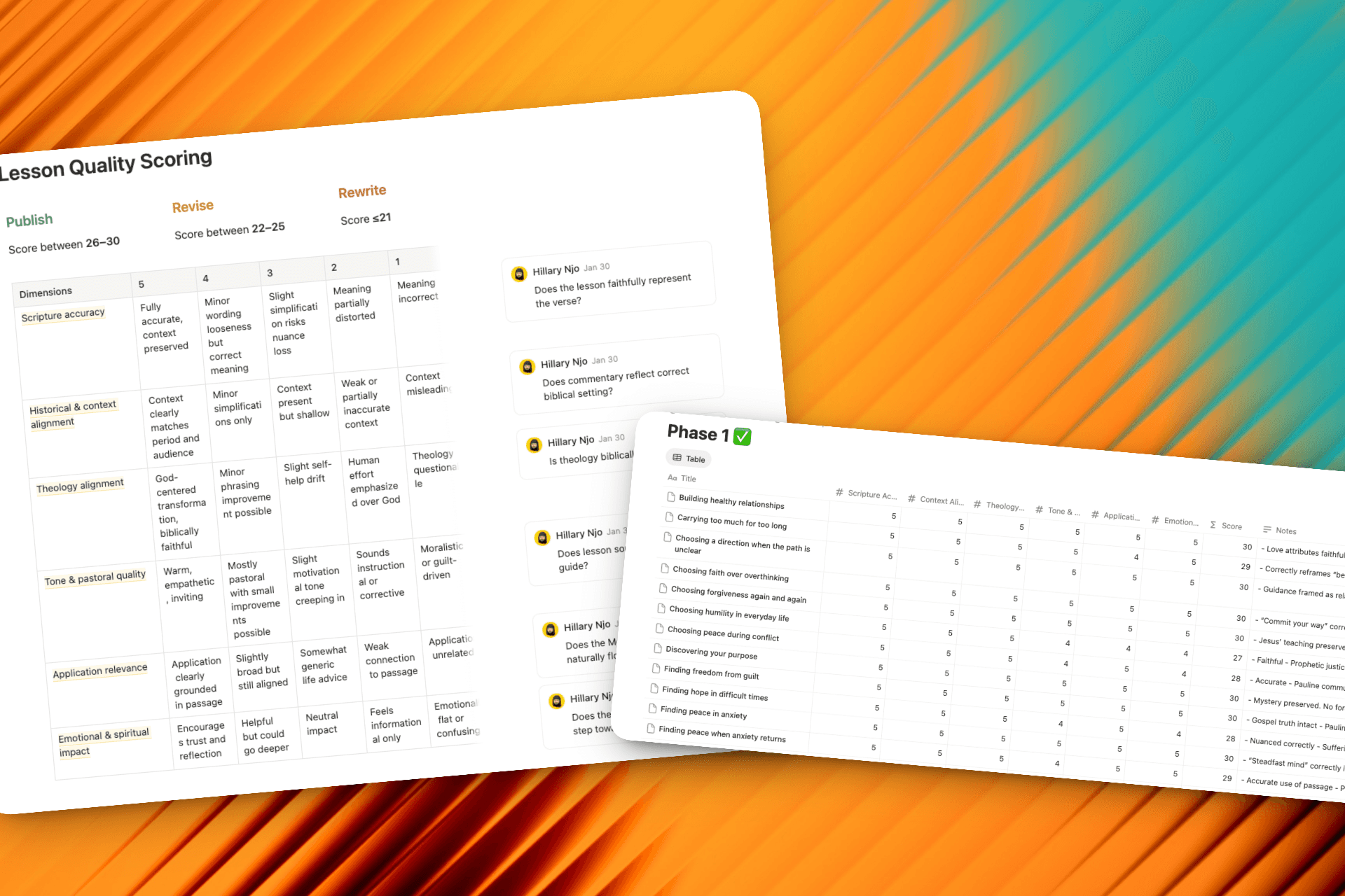
This system meant that shipping was slower. It also meant that what shipped could be trusted.

Building & Shipping the Product

Waymark was built entirely by one person, end to end. Product direction, UX and UI design, copywriting, app development, backend setup, analytics instrumentation, and launch preparation. Every part of it.

Experience & Content Design

Information architecture

Information architecture

Structured a linear guidance flow from Scripture to reflection, reducing cognitive load and creating a clear daily rhythm

Interaction design

Interaction design

Designed calm, predictable interactions with subtle motion (morph transitions, Lottie feedback) to guide attention and reinforce flow

Visual system

Visual system

Built a minimal, consistent UI optimized for long-form reading and emotional comfort

Content structure

Content structure

Defined a modular lesson structure (explanation, context, application, reflection, prayer) to turn Scripture into guided, practical insights

Product & Implementation

React Native with Expo

React Native with Expo

Built a single, high-quality mobile experience across iOS and Android (coming soon) with fast iteration cycles

Supabase backend

Supabase backend

Handled authentication, database, and backend logic, enabling rapid product development without heavy infrastructure overhead

Swift

Swift

Enabled native iOS widgets for daily lessons, reflections, and verses, extending the product experience beyond the app

PostHog

PostHog

Tracked user behavior such as lesson completion and reflection patterns to inform product decisions

OneSignal

OneSignal

Powered push notifications with controlled delivery and eligibility logic for gentle, non-intrusive re-engagement

The website was designed and built separately in Next.js and deployed on Vercel. It was treated as the first step of the product journey, not a marketing afterthought. The tone, pacing, and clarity of the site were designed to match the app, so that a user's expectations were set correctly before they ever opened it.

The mindset throughout the build was to ship something real and learn, rather than wait for perfect confidence. Constraints were treated as a design tool. Scope was defined early and held firmly.

Outcomes and Early Learning

Outcomes and Early Learning

Waymark launched quietly. No marketing campaign, no paid acquisition, no launch push beyond submitting to the App Store. What happened next was the first real signal that the product was connecting with people who genuinely needed it.

In the first release cycle, covering v1 and an early bug fix update, Waymark recorded 138 first-time downloads and 1,080 impressions with a 20% conversion rate on the App Store product page. The average App Store conversion rate sits between 3 and 5 percent. One in five people who saw Waymark downloaded it. That is not a distribution win. There was no distribution. It is a positioning win — the product page communicated the value clearly enough that the right people recognised themselves in it immediately.

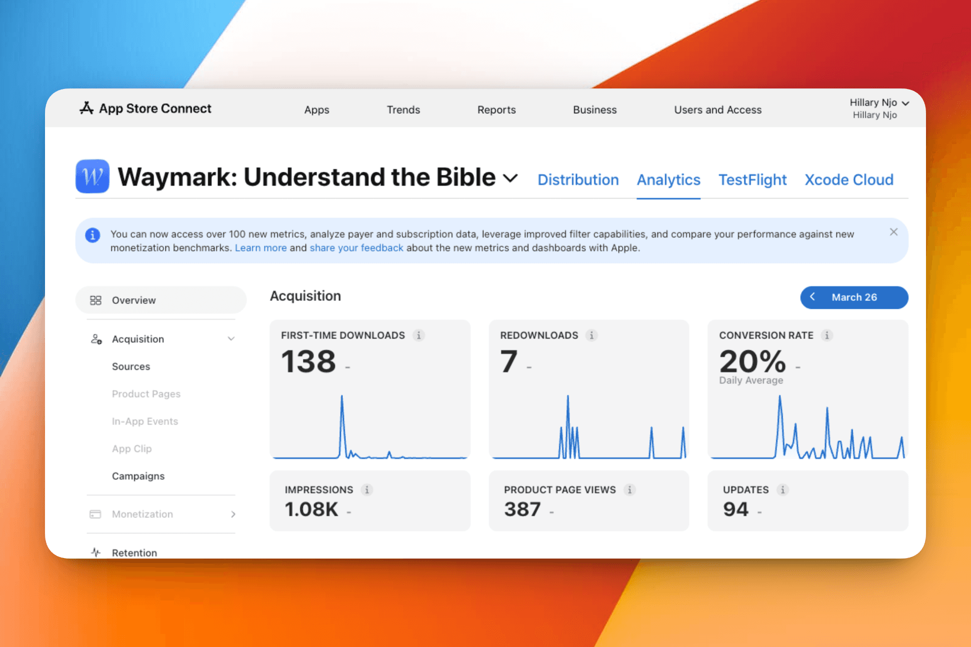
Seven users who had deleted the app redownloaded it. For a v1 with known rough edges, that is an early sign that the core experience was worth returning to even before it was fully polished.

The largest update since launch is currently awaiting App Store approval. It includes a rebuilt lesson experience, a new journal, home screen widgets, dark mode, and offline support. These numbers reflect only what the earliest, most unfinished version of Waymark could do. The clearer signal comes next.

What Changed in the Next Version

What Changed in the Next Version

The v1 data pointed clearly at two problems worth solving before doing anything else.

The App Store product page was not doing the product justice. The original screenshots described the product accurately but from the outside in. Headlines like "Understand the Bible daily", "Lessons based on your needs", and "Faith, made practical" told a reader what the app offered without addressing why they might need it. Someone arriving with doubt, anxiety, or confusion about Scripture would not see themselves in that language. The page communicated capability. It did not communicate empathy.

The new page was rebuilt around the moments people actually bring to the app. The first frame opens mid-situation: "When you feel anxious about the future." No product name, no feature pitch — just the emotional state the app is designed to meet. Every frame that follows is anchored in a real scenario: a private space to respond, keeping what resonates, watching your walk take shape. The interface is present throughout but it is secondary to the feeling. The shift is from describing what Waymark does to showing who it is for and when. If a 20% conversion rate was possible with a page that spoke to capability, the hypothesis is that a page that leads with empathy should do meaningfully better.

The new version also addressed two infrastructure gaps that made learning from v1 nearly impossible. Push notifications did not exist in the original release, which meant there was no way to bring users back gently after a quiet period. And without event tracking, there was no visibility into what users were actually doing inside the app — which lessons they completed, where they dropped off, whether the reflection prompt was being used at all. Both are now in place. For the first time, the next release will generate data that can actually inform decisions rather than just confirm that the app was opened.

The experience itself was also rebuilt substantially — a redesigned home and today screen, a new journal with highlights and organised entries, book-level progress tracking, home screen widgets, dark mode, and offline support. But the infrastructure and positioning changes matter just as much as the features. A better product with better tracking and a better first impression is a meaningfully different thing to ship than a better product alone.

Current Challenges

Building Waymark as a solo founder means every hard problem lands on the same desk. Two in particular are worth being honest about.

Getting the lessons right

Every lesson that ships carries real weight — it touches someone's understanding of Scripture, their relationship with faith, and in some cases, a difficult season of life they are actively navigating. There is very little margin for getting it wrong.


The challenge is not just accuracy. It is holding accuracy, tone, cultural context, theological balance, and emotional sensitivity all at once, for every lesson, at a pace that keeps the product fresh. The content evaluation framework helps, but it also means every lesson takes significantly longer to produce than it would without it. Scaling this without compromising the standard is one of the most unsolved problems in the product right now.

Getting the word out

Getting the word out

A product built for people who feel lost or overwhelmed in their faith is, by nature, looking for an audience that does not always know what to search for. That makes acquisition genuinely hard. But there is a more honest layer to this challenge: marketing and social media are not natural territory for me. Learning to build the product was difficult, but it came with a clear feedback loop — something works or it does not. Marketing does not work that way. The feedback is slower, the rules feel less logical, and the skill set is almost entirely different from anything I have trained for. In many ways, learning how to talk about Waymark publicly feels harder than learning how to build it.


Social media is the primary channel being explored, but faith content on platforms like Instagram and TikTok exists in a crowded and sometimes noisy space. Finding the right voice — one that reflects the calm and clarity of the product rather than performing for an algorithm — is an ongoing tension. The current approach is organic: short-form content that leads with the real problem, plain-language Scripture breakdowns that demonstrate the value before asking for anything, and showing up consistently in the spaces where people are already talking about faith. Paid acquisition is not yet viable. Word of mouth is slow. But the strategy is to earn trust publicly the same way Waymark earns it privately: one honest, useful moment at a time.

What This Changed About My Thinking

Building Waymark changed how I think about restraint as a product value.

For most of my career, the instinct has been to add. More features, more content, more paths through an experience. Waymark pushed back on that instinct at every turn. The constraint of one lesson per day, the removal of streak mechanics, the decision to make the journal completely private with no social layer, all of these felt like risks at the time. In practice, they are what makes the product feel the way it does.

I also learned something about the relationship between personal experience and product clarity. Because this problem was lived before it was designed, the decisions came faster and the priorities stayed clear. There was never a question about what mattered most, because I had been the user. That kind of clarity is hard to manufacture and easy to underestimate.

Waymark is proof that not every product needs to optimize for intensity or frequency. A guidance-first approach can create deeper trust by reducing friction, both cognitive and emotional, rather than by adding more.

Future Direction

The foundation Waymark is built on is intentionally modular. The lesson structure, the reflection system, and the interaction model are all designed to scale into experiences that do not yet exist in the product.

Android support

Android support

Immediate next step. A significant portion of the audience is waiting on this before they can use Waymark at all. Bringing it to Android means rebuilding nothing and reaching far more people.

Immediate next step. A significant portion of the audience is waiting on this before they can use Waymark at all. Bringing it to Android means rebuilding nothing and reaching far more people.

Multi-language

Multi-language

Faith is global, and the need for plain-language Scripture guidance is not limited to English speakers. Expanding into other languages, starting with the communities where this gap is most felt, is a natural extension of what Waymark already does.

Faith is global, and the need for plain-language Scripture guidance is not limited to English speakers. Expanding into other languages, starting with the communities where this gap is most felt, is a natural extension of what Waymark already does.

Search

Search

The vision is not a simple keyword lookup but a conversational AI experience: a user types a verse reference, a word, or a question, and the response surfaces relevant lessons they can open directly from the chat. This is especially meaningful for people reading a physical Bible who want to understand what they are reading right now, in the moment, without having to navigate a content library. The chat becomes the bridge between the page they are holding and the understanding they are looking for.

The vision is not a simple keyword lookup but a conversational AI experience: a user types a verse reference, a word, or a question, and the response surfaces relevant lessons they can open directly from the chat. This is especially meaningful for people reading a physical Bible who want to understand what they are reading right now, in the moment, without having to navigate a content library. The chat becomes the bridge between the page they are holding and the understanding they are looking for.

Audio lessons

Audio lessons

Many people encounter Scripture most naturally by listening, whether in church, during a commute, or in quiet moments at home. Bringing the lesson experience into audio extends Waymark to those contexts without changing what makes it work.

Many people encounter Scripture most naturally by listening, whether in church, during a commute, or in quiet moments at home. Bringing the lesson experience into audio extends Waymark to those contexts without changing what makes it work.

Community prayer

Community prayer

Where Waymark begins to grow beyond the individual. A shared prayer space, where users can post requests and others can pray over them, introduces a communal dimension to the experience without turning it into a social platform. The goal is warmth and mutual support, not engagement metrics.

Where Waymark begins to grow beyond the individual. A shared prayer space, where users can post requests and others can pray over them, introduces a communal dimension to the experience without turning it into a social platform. The goal is warmth and mutual support, not engagement metrics.

Every next step is shaped by the same question that started this: how can this help someone understand the Bible and bring it into the life they are already living?

Create a free website with Framer, the website builder loved by startups, designers and agencies.