
Role
Product Designer
Timeline
Industry
Health Tech
Platform
iOS and Android
Feature Brief
Elfie already had a Health Score: a composite metric reflecting a user's health based on the data they tracked in the app. Biological Age was a reframing of that concept — expressing a user's health status not as an abstract score but as an age their body reflects based on lifestyle, behaviours, and health metrics.
The idea has intuitive appeal. Most people have an instinctive sense of what it means to feel younger or older than their years. Framing health as an age rather than a percentage makes the concept immediately legible to a wide audience and creates a more emotionally resonant goal: not just improving a number, but actively reducing your biological age.
The design challenge was not just making this concept visually clear. It was making it trustworthy, motivating, and honest — particularly given that the estimate is calculated from self-reported data and carries inherent uncertainty.
The scientific foundation was serious. Elfie's Biological Age model was developed using NHANES data (2005–2009) with linked long-term mortality outcomes, validated in a separate cohort. The model integrates up to 14 health factors — including BMI, sleep, physical activity, smoking, alcohol consumption, and medical history — derived from Cox proportional hazards models. A simplified version relies only on self-reported variables, making it accessible without requiring blood tests or clinical data. That accessibility was central to the design brief: a feature grounded in peer-reviewed science, communicated in a way anyone could engage with.
What I Designed
Starting with the result screen
The design process started not with onboarding but with the core experience: what does a user actually see when they discover their Biological Age? Getting that screen right first was the right sequence. If the result screen could not communicate the concept clearly, build trust, and motivate action, there was no point designing a path to reach it.
The result screen had to do several things simultaneously: surface a number that might be higher than the user's chronological age, explain what that number meant, show which factors were contributing to it, communicate the confidence level of the estimate, and motivate the user to improve — all without feeling clinical, alarming, or overwhelming.

The early explorations established the conceptual architecture: biological age embedded alongside the health score, contributing factors broken down by category, a confidence indicator visible rather than hidden, and AI-generated insights contextualising what the number meant for the individual user. Three layout variants were explored in parallel to test different approaches to information density and visual hierarchy before committing to a direction.
The honesty problem was real throughout. The estimate carries approximately 58% accuracy, which a significant portion of testers noticed and commented on. Rather than hiding that limitation, I designed the confidence indicator as a visible, named part of the result — framing lower accuracy as an invitation to input more data rather than a credibility problem. The approach worked: 89% of testers said they felt motivated to enter more data to improve their accuracy.
An A/B test of two result screen layouts was run as part of the Maze study. The right-side variant — which offered more structured information breakdown, an accuracy percentage, and clearer factor-level detail — was preferred by 66% of testers over the original left-side version. That finding shaped the final direction.
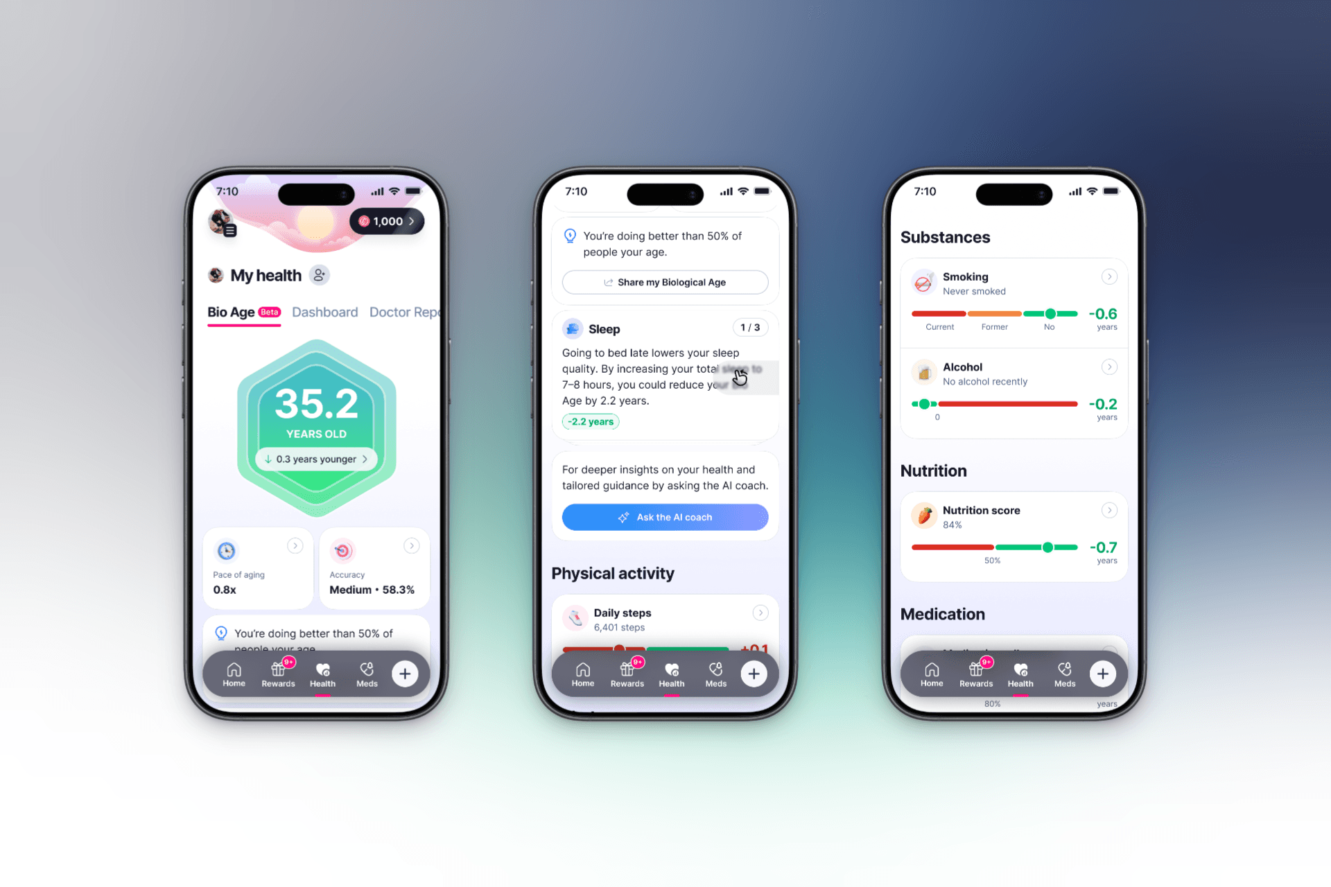
The final direction settled on a single unified screen combining the health score and biological age, with a full category-level breakdown beneath — physical activity, substances, nutrition, medication, body composition, sleep, blood pressure, and heart health — each with its own contributing data points. The confidence indicator sat prominently alongside the score. The structure gave users both the headline result and the granular detail needed to act on it.
Working backward to onboarding
With the result screen direction established, the next question was how users would be introduced to the concept before they ever saw their result. Introducing a new metric too early in onboarding creates confusion; too late, and users arrive at the result without the mental model to make sense of it.
I defined the touchpoints within the onboarding flow where Biological Age would be introduced — explaining what it was, which factors influenced it, and how Elfie would calculate it — before any data entry was requested. The goal was to create comprehension before obligation. A user who understands why their daily steps and sleep patterns connect to their biological age is far more likely to track those things consistently than one who sees data entry as a disconnected chore.
The onboarding flow achieved a 96.1% success rate across 76 testers, with a 35.2% misclick rate flagging some navigation friction to address in the next iteration.
The Maze Test
The usability test was run on Maze with 84 testers for the first section and 73 for the deeper feature exploration. This was the only round of usability testing conducted on the feature during my tenure.
Key findings:
The onboarding flow introduced Bio Age successfully. 92% of testers already used a health app, making the audience well-calibrated for a feature of this kind. Comprehension of what Biological Age meant was high — the majority of testers could accurately describe the concept in their own words after seeing the onboarding screens, without prompting.
Trust in the Bio Age value averaged 7.2 out of 10. Given that the estimate is based on self-reported data with stated uncertainty, a 7.2 trust score is a meaningful result — users understood the limitations and still found the metric credible and useful.
Motivation to change behaviour averaged 7.8 out of 10. This is the number that matters most for Elfie's core purpose. A feature that shows users their biological age is only valuable if it motivates them to act. A 7.8 motivation score, with 79% of testers saying they would check the feature weekly or daily if it updated in real time, suggests the concept was landing as intended.
The overall feature rating averaged 8.3 out of 10 across 73 testers.
For re-engagement, 36% of testers said notifications or reminders would bring them back, 26% said they would return on their own, and 79% indicated they felt motivated to enter more data to improve their accuracy — a strong signal for Elfie's data collection loop.

What Shipped vs. What I Designed
The shipped feature was built from my final design direction. The core decisions carried through: the unified health score and biological age screen, the category-level factor breakdown, the visible confidence indicator, the onboarding introduction before data entry. The visual details evolved after I left — as they typically do between a designer's final direction and a production build — but the structural architecture and the reasoning behind it remained intact.
The App Store description of the shipped feature reflects the same positioning framing I was working from during design: "How old is your body, really? Biological Age combines 14 science-backed health factors into one clear score that reflects how your body is functioning. Unlike a static lab test or simple fitness scores, your Biological Age updates as your habits change." The question-first framing, the emphasis on habits over static measurement, the contrast with clinical tests — these were the same positioning decisions present in the prototype.
What This Project Taught Me
The Bio Age project sharpened my thinking about the relationship between honesty and trust in health product design.
The natural instinct when a metric has uncertainty is to soften or hide it. The 58% accuracy figure could easily have been omitted from the result screen — most users might not have noticed, and those who did might have felt reassured by a cleaner presentation. But the testing told a different story. Users who understood the accuracy limitation were more motivated to improve it, not less engaged by it. Transparency created agency rather than eroding trust.
That insight — that being honest about a product's limitations can strengthen rather than weaken engagement when framed correctly — is something I have carried into every health design problem since.
Working as the sole designer on a feature at a company I left before seeing it ship also reinforced something about the nature of design contribution. The concept, the structure, the research, the validated direction: those things persist beyond the person who created them. What a designer leaves behind in a well-documented, well-tested prototype outlasts their tenure in ways that are genuinely consequential.