Role
UI/UX Project Lead
Team


Timeline
Mar 2023 - Oct 2024
Industry
Health Tech
Type
iOS, Android, Web
The stakes of this project were unusually high for a design engagement. Prodia had over a million existing users — many of them older, long-time patients who knew the legacy app well. Any redesign that moved too fast, felt too foreign, or introduced new friction risked losing exactly the people the platform was meant to serve.
At the same time, Prodia needed to attract a younger, more digitally native audience to secure long-term growth. The new platform had to feel modern enough to compete with consumer health apps while remaining familiar enough not to alienate its existing base.
And it had to ship across three distinct platforms — patient app, doctor and health coach app, and admin web — simultaneously, under ambitious timelines, with a large cross-functional team.
The starting data made the urgency concrete. Only 28.7% of users who installed the app completed registration. More than seven in ten people who downloaded the app left before they ever used it. That number was the clearest signal of where the work needed to start.
My Role


Starting with the biggest drop-off
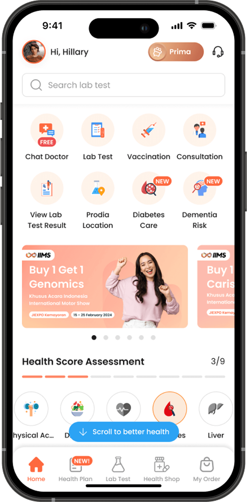
With limited access to user research — a reality of the project's timeline and client constraints — the team worked with what was available: funnel data, engineering insights, and business priorities. The 28.7% registration completion rate pointed to a clear starting point. Before addressing features, information architecture, or visual design, the onboarding flow needed to be rebuilt.
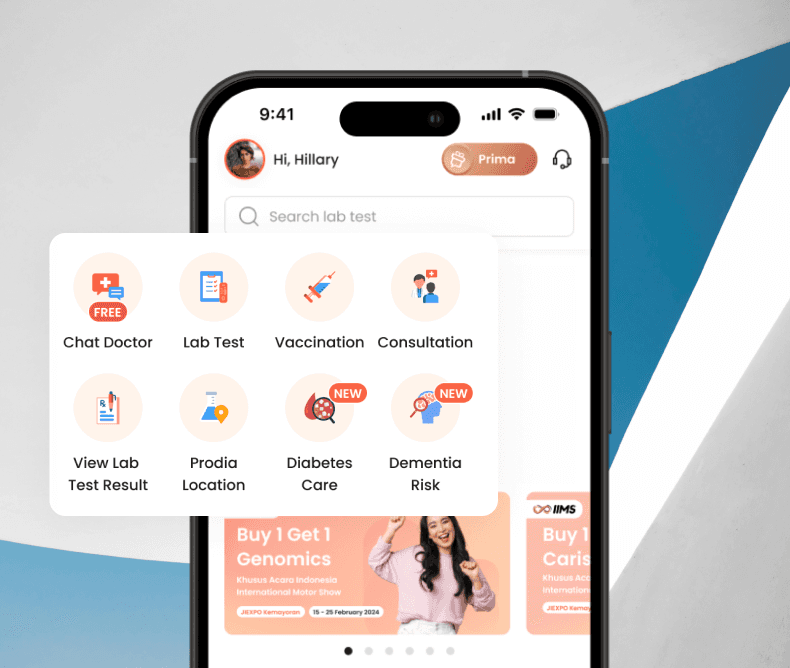
The redesign introduced clear progressive steps, plain-language guidance, and a reduced cognitive load at each stage. Key actions — booking a lab test, viewing results — were surfaced directly on the home screen rather than buried in navigation. The goal was to build trust through predictability: a user who understands what is happening and what comes next is far more likely to complete the flow.
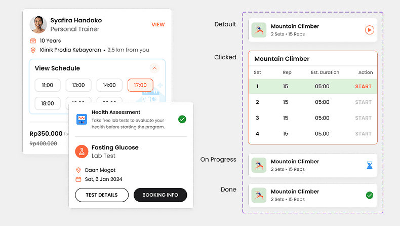
Designing for two users at once
A two-phase process built for speed without sacrificing craft
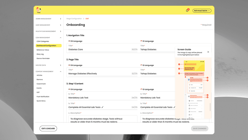
Building a system, not just screens
Three platforms with three distinct audiences — patients, doctors and health coaches, and admins — could easily have produced three divergent design languages. Preventing that required infrastructure: a modular design system with shared spacing rules, colour tokens, typographic scales, and component behaviours that could flex for each platform's specific needs without losing brand coherence.
The system also had a practical team benefit. When the second designer joined the project, the design system allowed her to onboard and contribute meaningfully in significantly less time than starting from documentation alone.


Outcomes
Since my tenure, U by Prodia has surpassed 1.4 million downloads on Android, averaging approximately 47,000 downloads per month at its peak. The foundation for that growth — the onboarding redesign, the design system, the booking experience — was built during the period I led the design work. Registration completion improved meaningfully following the onboarding redesign, moving the product away from a flow that was losing more than seven in ten users before they took a single action. Lab test booking drop-off decreased as key conversion actions were surfaced earlier in the experience.
The design system enabled faster delivery across all three platforms and accelerated onboarding for new team members joining the engagement. Strategic workshops run at key milestones helped the client clarify MVP scope and feature priorities, reducing scope creep and keeping the delivery timeline manageable.
In February 2026, U by Prodia received the Indonesia Popular Digital Products Award 2026, assessed through focus groups, quantitative survey, and accumulated scoring across customer experience criteria. The platform's Digital Service Transformation Director simultaneously received the Indonesia Popular CIO & CTO Award 2026, selected from a field of more than 200 candidates.
What This Project Taught Me
Leading a project of this scale — across platforms, timelines, and a large cross-functional team — taught me that process design is product design. The two-phase delivery structure, the design system architecture, the stakeholder workshops: none of these felt like design work in the traditional sense, but all of them were what made the actual design work possible.
I also learned something about designing under constraint that I have carried forward. When user research is limited, the data you do have becomes more important, not less. The 28.7% registration completion rate was not just a metric. It was the clearest signal available about where the real problem lived, and it shaped every subsequent decision.
Healthcare design carries a weight that most product categories do not. A user navigating this app may be anxious about a result, uncertain about a diagnosis, or managing something serious. Every design decision — how a result is displayed, how a flow is sequenced, how an error state is written — exists in that context. Holding that awareness consistently, across a 18-month engagement and three platforms, was one of the most demanding and meaningful parts of the work.